NI

Redesigning Divvy's Onboarding for Speed, Clarity, and Conversion

This redesign focused on reducing friction where it mattered most-meeting user needs while aligning with business and regulatory constraints.

Lead Product Designer – Divvy Onboarding

Led discovery, design, and implementation over 4 months

Collaborated with product, engineering, and customer success

Conducted user research and usability testing

Created design system components for future reuse

A Critical Growth Blocker

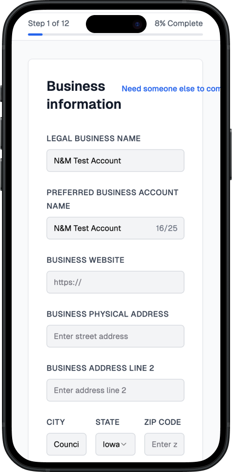
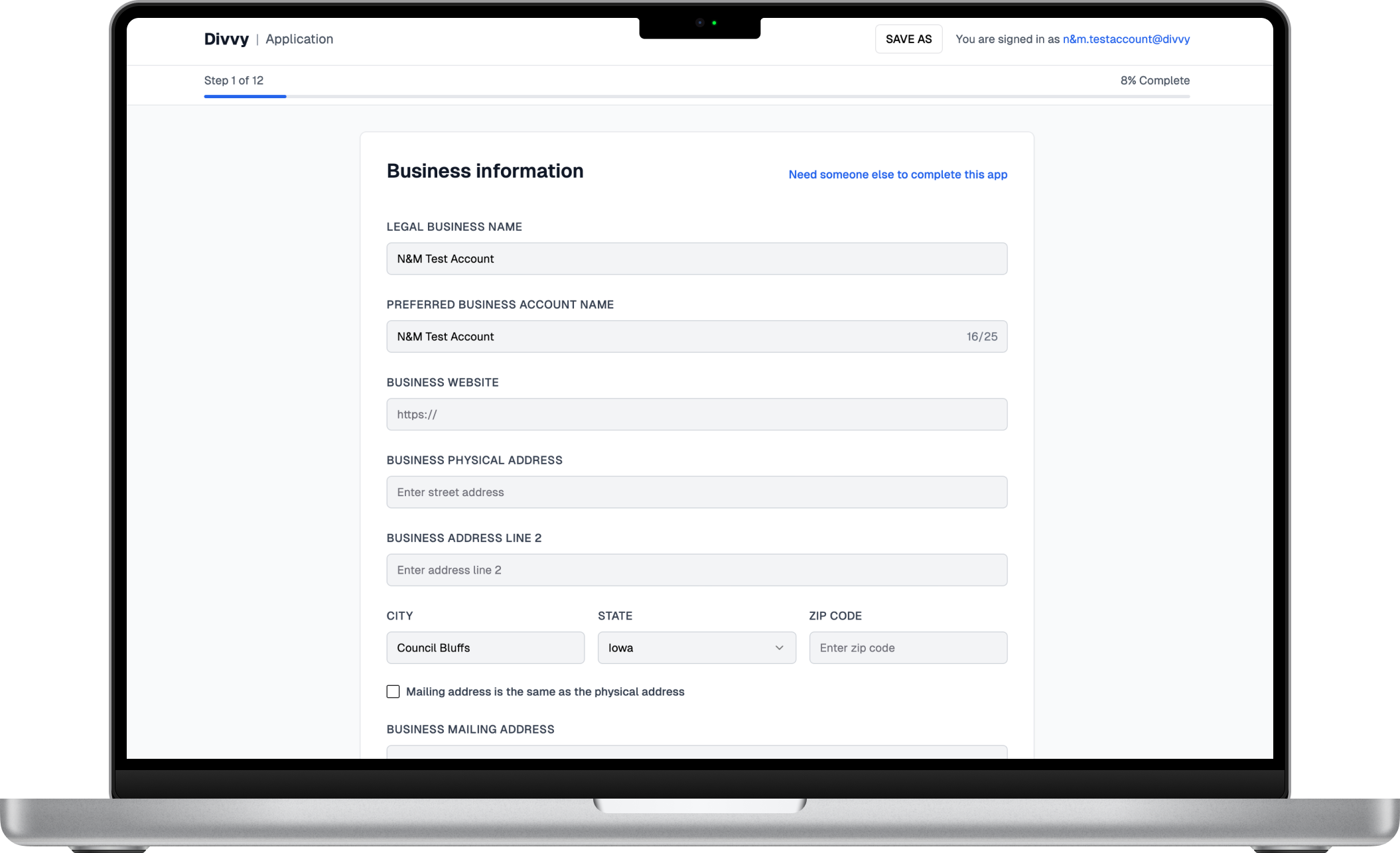
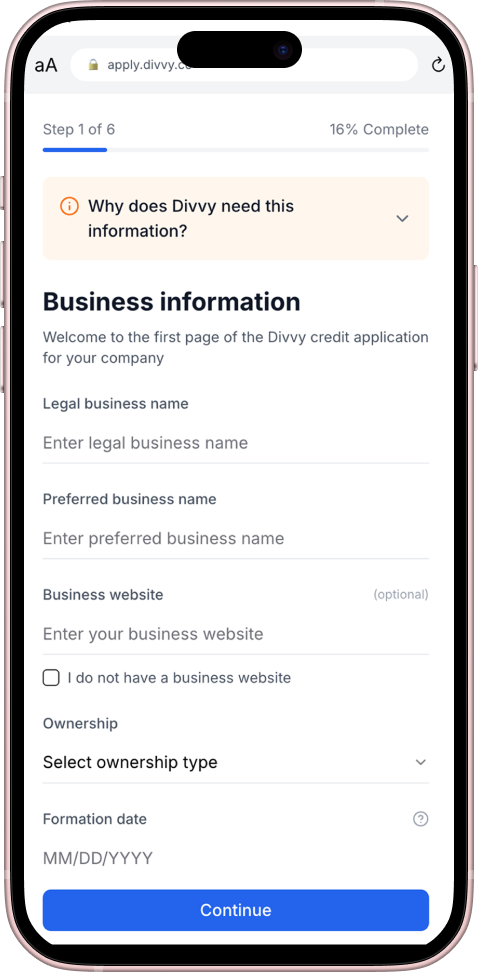
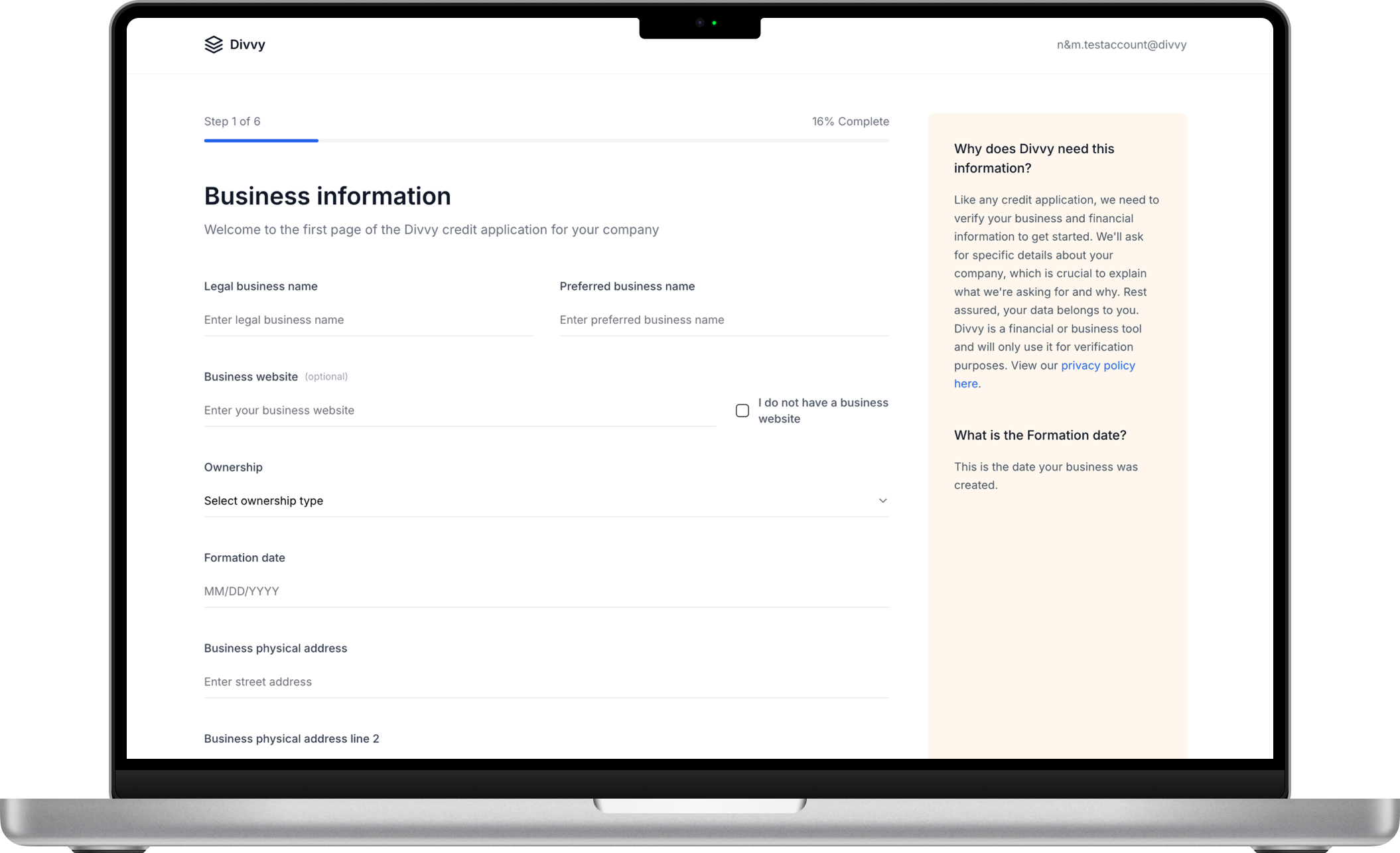
Divvy's growth team flagged onboarding as our biggest conversion bottleneck. With 10,000+ monthly signups, even small improvements would have massive impact.

Customer success was overwhelmed with confused users, and our NPS scores showed onboarding as the primary pain point. The executive team made this a Q1 priority.

Users dropped off halfway. We found out why.

Mobile before: cluttered form with multiple fieldsDesktop before: lengthy form with poor information hierarchy

Step 1 of 12 - Before: Overwhelming form fields, mobile not optimized. After: Clearer flow, better layout, and reduced support tickets.

Onboarding took ~7 minutes longer than competitors

47% drop-off rate

Major user confusion at step 3 of 5

73% support tickets

Users couldn't assess card fit

$2.4M potential ARR lost

Key Constraint

We couldn't change the underlying card approval process or legal requirements-the solution had to work within existing technical and compliance constraints.

Mobile after: streamlined experience with clear progress indicatorsDesktop after: improved layout with helpful context

Step 1 of 6 - After: Clearer progress indicators, contextual help, and simplified form fields reduced completion time by 40%.

Clear progress indicators and step reduction

40% faster completion

Contextual help explains why information is needed

68% fewer support tickets

Responsive design optimized for all devices

89% completion on mobile

What the data revealed

7 min

longer than competitors

Hotjar recordings showed users pausing, scrolling back

47%

drop-off at step 3

Card selection caused the most confusion

73%

support tickets about onboarding

"I'm not sure if this is right for me"

Our north star

Clarify the Steps

Make progress clear and expectations obvious at every moment

Let Users Choose Their Path

Provide options without overwhelming-guide, don't dictate

Design for Mobile First

Optimize for the smallest screen, enhance for larger ones

Streamlined for confidence

Welcome to Divvy application screen

Step 1: Welcome

Simple email entry with clear next steps

Start spending smarter screen

Step 2: Business Info

Helpful tips guide users through the process

Divvy may not be a good fit screen

Step 3: Transparent Results

Clear messaging with alternative options

Streamlined flow with clear progress indicators

Results that mattered

3x

higher completion rate

From 53% to 89%

40%

fewer support tickets

Customer success team relief

85%

user satisfaction score

Up from 62%

$2.4M

additional ARR

From improved conversion

Simple flows, strategic impact

This redesign wasn't about reducing clicks-it was about giving users confidence at a critical moment. Every decision was rooted in real friction, tested iteratively, and built to flex with future card types and user needs.

The biggest lesson: sometimes the most impactful design work happens in the unsexy moments. Onboarding isn't glamorous, but it's where trust is built or broken. By treating it as a strategic priority rather than a necessary evil, we transformed a major business blocker into a competitive advantage.

Final desktop welcome screen
"This is the first time I actually wanted to finish applying."
- Beta user feedback

Framework Impact

The design system and patterns from this project were adopted across 3 additional signup flows, creating consistency and reducing future design debt.